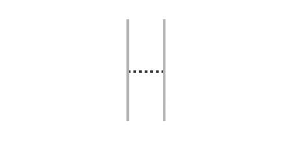
Kerning is the distance between two glyphs in a font.

A font is a complete set of characters - letters, numbers, punctuation, and symbols - built to a single consistent design, so that any word typed in it holds together as one visual system rather than a pile of unrelated marks. Technically, a font is data: a file containing the outlines of every glyph, the spacing between them, and the rules for how they combine, all interpreted by a computer or device to render text on screen or in print.
The word itself comes from the French fonte, meaning "a casting" - a reference to the molten metal poured to cast physical type in the age of the printing press. For centuries, a "font" meant one specific size and weight of a typeface, cast by hand, letter by letter, in lead. Digital type collapsed that distinction: a single font file can now scale infinitely, adjust weight, and carry hundreds of glyphs across multiple languages and alphabets.
What hasn't changed is the purpose. A font is a tool for translating thought into a visible, readable form - and the shape of that tool always leaves its trace on the message it carries.
Need More Fonts exists to build that tool differently, one independent typeface at a time.

“I was bored from seeing the same fonts used everywhere I looked.” - Worship Artisan
Kerning is the distance between two glyphs in a font.
Web fonts are typefaces designed and optimized for the digital space.
Fonts containing glyphs for Cyrillic languages like Bulgarian, Ukrainian, Russian and more.
Every typeface carries a mood before it carries a message. A tighter letter spacing reads faster and colder. A looser, uneven rhythm reads slower and more human. The angle of a stroke, the weight of a serif, the way one letter leans into the next - these aren't decorative choices, they're intentional ones. Change the shape, and you change how a sentence feels before a single word is read.
This is the part of type design that resists easy explanation: rhythm. A font's rhythm is the pattern its letters make when strung together — the visual pulse of a word. A jagged, scratchy rhythm feels aggressive or unsettled. A clean, evenly spaced rhythm feels controlled, modern, trustworthy. Two fonts can share the same alphabet and say completely different things.
Choosing a font, then, isn't really about picking letters - it's about picking an aesthetic, a tone, an atmosphere for the message underneath it. The right font doesn't just display your words. It tells the reader how to feel about them before they've even started reading.
That's the question worth asking before any design decision: not "does this font look good," but "does this font feel right."
Cyrillic script emerged over a thousand years ago in the First Bulgarian Empire, developed to serve Slavic liturgical and literary texts, and it has since evolved into the writing system of over 250 million people across Eastern Europe and Central Asia. Despite that scale, Cyrillic typography has historically been treated as an afterthought - a translated add-on bolted to Latin type families designed with an entirely different language, rhythm, and history in mind.
That gap is exactly why independent, interesting font foundries matter. Large type libraries move slowly and cautiously, often producing Cyrillic support that's technically functional but creatively hollow - Latin shapes stretched thin over a different alphabet, rather than glyphs built to carry the same personality, weight, and rhythm as their Latin counterparts. Independent foundries have the freedom to design Cyrillic first, not last - to treat it as a full creative language rather than a compliance checkbox.
The future of type needs more of that: smaller studios willing to experiment, take aesthetic risks, and give Cyrillic the same depth of character that Latin type has enjoyed for centuries.
Need More Fonts was built on that belief - every typeface here ships with Cyrillic support, designed with the same intent as its Latin counterpart, never as an afterthought.

Every font starts as a feeling before it's a single letterform - a mood, a reference, a piece of music, a movie scene, a texture on a wall. That feeling gets translated into a handful of test shapes: a lowercase "a," an "o," an "n." These early letters set the DNA for everything that follows - the width, the contrast, the angle, the personality the rest of the alphabet has to inherit.
From there, the alphabet expands letter by letter, with each new glyph tested against the ones before it. Consistency is the hard part: a shape that looks striking in isolation has to still make sense sitting next to twenty-five other letters, in a paragraph, at different sizes. Numerals, punctuation, and a full Cyrillic set come next, built with the same rhythm and intent as the Latin glyphs rather than adapted after the fact.
Then comes testing: setting the font into mock posters, subtitles, headlines, and body text to see how it behaves under real conditions, not just on a specimen sheet. Kerning gets adjusted, weights get refined, edge cases get fixed.
What began as a single feeling ends as a fully working typeface that is free, licensed under the SIL Open Font License, and ready for someone else's project.